Anúncios
Can a single change make your product safer, fairer, and more profitable? Major platforms show huge revenue—Tinder, Bumble, and Hinge pulled millions in U.S. in‑app purchases in February 2024—yet many systems still leave people with visual, hearing, motor, or cognitive challenges behind.
Making an app usable for everyone is not charity. It is a core product requirement that improves the experience for all users and boosts engagement. Inclusive choices smooth key flows like onboarding, profile creation, discovery, matching, and messaging.
Anúncios
The U.S. legal context—ADA expectations and WCAG standards—means accessibility is also risk mitigation for any platform at scale. This guide maps practical steps developers and teams can apply early in development, with concrete checks for each screen and interaction.
Understanding why accessibility drives better dating app engagement in the United States
Speed, clarity, and trust drive how people use modern dating apps in the United States.
Anúncios
U.S. users expect fast onboarding, predictable navigation, and clear interface patterns so they can find potential matches without confusion. When key screens load quickly and labels are obvious, users complete registration and start interacting sooner.

From swipe culture to inclusive connection: aligning UX with real user behavior
Tinder, Bumble, and Hinge shaped expectations: quick actions, simple gestures, and prompts that encourage replies. But gesture-only flows leave out people who need alternative controls.
Providing buttons, keyboard support, and clear affordances ensures fair access to matches for more users.
User intent today: fast onboarding, authentic matches, safe and inclusive experiences
Different intents coexist — casual meetups and long-term relationships — so the interface should reduce friction across both paths. Clear hierarchy, readable text, and high contrast help users act with confidence.
- Faster onboarding increases retention and repeat engagement.
- Credibility signals like verification and safety messaging build trust.
- Personalization and transparent match logic improve satisfaction.
In short, thoughtful choices in navigation and interaction modes convert first-time users into repeat users while lowering support costs and increasing long-term engagement.
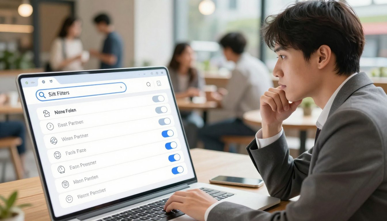
Mapping accessibility gaps in today’s dating apps
Many popular dating services cram too much into single screens, and that overload hides the actions people need.

Cluttered layouts create cognitive load. Dense text and many buttons make it hard for users to find core actions like Like or Message.
Unclear navigation—ambiguous labels, inconsistent placement, or hidden menus—reduces completion of key flows. That lowers matches and increases drop-offs.
Weak visual hierarchy buries primary controls. Small icons, low contrast, and unreadable text push features out of view for many users.
| Gap | Impact on users | Example | Practical fix |
|---|---|---|---|
| Cluttered screens | Cognitive overload | Too many action buttons on profile | Simplify layout; prioritize CTAs |
| Gesture-only swiping | Excludes motor-limited users | No buttons for like/discard | Add large tap targets and controls |
| Poor image/text support | Blocks visually impaired users | Missing alt text, low contrast | Provide alt text; adjustable text size |
| Missing captions | Hearing-impaired users miss content | Video autoplay without captions | Include captions and text alerts |
- Use clear labels and consistent navigation.
- Prioritize readable text, contrast, and larger targets.
- Offer alternatives to swiping and richer image descriptions.
Accessible Dating App Design
Regulatory standards and usability goals must sit side‑by‑side when teams build a modern dating product. Meeting WCAG and ADA expectations protects the platform and helps users complete key tasks like signing up, searching, and messaging.
WCAG and ADA: the non‑negotiables for compliant experiences
WCAG’s core principles — perceivable, operable, understandable, and robust — map directly to common interface needs. Examples: readable text for perception, keyboard support for operability, plain language for understanding, and semantic markup for robustness.
In the U.S., the ADA can trigger legal challenges when consumer apps block access. Following WCAG reduces risk and creates a predictable, safer experience for users across devices.
Accessibility as product strategy: reach, trust, and retention
Treat accessibility as growth work. Accessible features expand your platform to more users, including people on older phones or with limited bandwidth.
Operationalize accessibility by adding acceptance criteria to stories, using checklists in development, and running automated and manual audits with third‑party tools and services.
“Clear communication and consistent behavior build trust; documented criteria keep teams aligned.”
- Create design tokens for contrast and guidelines for focus states.
- Use inclusive research panels to validate features with real users.
- Partner with external testing services for continuous monitoring and audits.
Foundational UI choices that improve access: color, typography, and layout
Simple color, type, and layout rules cut friction and help users act quickly. These choices shape how people scan profiles, compare images, and tap core features like Like, Match, and Message.
High-contrast palettes and scalable typography
Pick color pairs that meet WCAG contrast for text and buttons. Use a neutral base, then reserve bright accents for primary actions.
Set minimum type sizes (16px body, larger for buttons) and allow user-adjustable text without breaking layouts.
Clean layouts that prioritize core actions
Use a 4- or 8-point grid, generous spacing, and predictable placements for primary controls. Keep screens focused: one main CTA per view and clear secondary actions.
| Element | Target | Why it matters | Example |
|---|---|---|---|
| Contrast | 4.5:1 text, 3:1 large text | Readability in sunlight and low light | Dark text on light background for profiles |
| Typography | 16px min body; scalable | Prevents truncation and preserves hierarchy | Variable font with user size control |
| Images & ratios | 3:4 or 4:5; alt text required | Keeps faces visible and screen readers informed | Profile media with descriptive alt copy |
| Spacing & grid | 8–16px gutters; large tap targets | Reduces accidental taps and clutter | Clear zones around Like/Message buttons |
Consistent components, calm motion with reduced-motion options, and clear helper text help users move faster. These foundational choices improve usability and make core interactions reliable across devices and contexts.
Designing inclusive interactions beyond swiping
Beyond swiping, interaction choices must let every user complete core actions with confidence.
Swipe-only controls can block people with motor differences. Add clearly labeled buttons and large tap targets that mirror common swipe actions. That gives a predictable path for everyone.
Alternatives to gestures and voice control
Provide visible buttons for Like, Skip, and Message alongside gestures. Make tap targets at least 44px and keep spacing ample to reduce accidental taps.
- Implement voice commands for browsing, liking, and messaging with spoken confirmations.
- Offer adjustable gesture sensitivity and an option to disable complex swiping.
- Include haptic and sound cues plus visual confirmations and optional captions.
Keyboard, switch control, and motor support
Support full keyboard navigation and switch control across iOS and Android. Ensure logical tab order, visible focus states, and keyboard-accessible menus.
Use sticky action bars, progressive disclosure for secondary controls, and undo or confirmation guards to avoid unintended matches. QA these inputs thoroughly so basic functionality works for all users.
How to implement accessibility across core dating app screens
Map the user’s intent on every screen and remove anything that does not help them reach it.
Login and Registration
Keep sign-in flows short. Use clear labels, visible focus order, and descriptive error messages.
Offer social sign‑ins but ensure field instructions and recovery steps work with keyboard and screen readers.
Profile Creation and Management
Support descriptive alt text for images and captions for videos. Let users add media with clear guidance.
Ensure screen reader labels, logical headings, and flexible uploads so profiles complete smoothly.
Matching, Discovery, and Chat
Provide adjustable card density, labeled filters, and keyboard controls for matching. Make primary actions reachable via keyboard and assistive tech.
In conversations, add captions for video, adjustable text sizes, and safe media previews with content warnings.
Search, Settings, and Notifications
Offer granular controls for notification types and delivery. Respect device text and motion preferences and include accessible loading states and undo options.
| Screen | Common pitfall | Practical fix |
|---|---|---|
| Login | Complex forms; missing error recovery | Short fields; clear errors; keyboard focus order |
| Profile | Missing alt/caption support | Guided media upload; descriptive alt fields |
| Matching | Gesture-only controls | Buttons, adjustable density, labeled filters |
| Chat | Unreadable media or fixed text size | Captions, text scaling, safe previews |
Onboarding that reduces friction while meeting diverse needs
Onboarding should move people from install to value without extra steps or guesswork.
Define a mobile-first onboarding process with short steps and clear progress indicators. Keep navigation obvious so users always know what comes next.
Mobile-first flows, social sign‑ins, and guided setup
Offer fast social sign‑ins (Apple, Google) but show accessible consent and privacy notes. Balance speed with clear controls so a user can grant or decline without confusion.
Provide guided setup with examples and inline validation. Let people skip nonessential steps and remind them to finish later. This helps users reach core features faster.
| Focus | Common pitfall | Practical option | Benefit |
|---|---|---|---|
| Progress | Long forms | Step indicators, short fields | Higher completion |
| Permissions | Opaque prompts | Accessible modals with reasons | Fewer denials, trust |
| Settings | Hidden controls | Privacy defaults; edit path | Safer first use |
| Tutorials | Lengthy guides | Short multi-input demos | Faster familiarity |
Respect device settings like larger fonts, high contrast, and reduced motion. Measure onboarding completion and error rates to refine the process over time.
Building, testing, and iterating for accessibility
Embed accessibility tokens and component rules in Figma to reduce ambiguity at handoff.
Wireframes to prototypes: Figma workflows that bake in access early
Start the development process with a Figma-first workflow. Define tokens for contrast, type scale, spacing, and focus states before high-fidelity mockups.
Build reusable components that include ARIA intentions and alt-text fields in component notes. This keeps developers and designers aligned during handoff.
Assistive tech testing: screen readers, voice, captions, and contrast audits
Create an OS-level test matrix for iOS and Android. Include VoiceOver, TalkBack, voice control, screen magnifiers, captions, and color contrast checks.
Validate interactive prototypes for keyboard flow and switch control paths so users with varied motor needs can move through core screens.
Continuous improvement: usability data, sentiment, and user feedback loops
Recruit participants with disabilities for moderated and unmoderated sessions. Correlate findings to onboarding and messaging drop-offs using analytics.
Use sprint-based audits, regression tests, and an accessibility backlog with acceptance criteria. Track KPIs like contrast compliance rate and assistive-tech success paths.
| Stage | Action | Outcome |
|---|---|---|
| Prototype | Interactive keyboard & screen reader flows | Fewer implementation surprises |
| Testing | Voice control, captions, contrast audits | Early issue detection |
| Iteration | Analytics + user feedback | Targeted fixes with measured gains |
Document ARIA roles, semantic structure, and alt guidance in every ticket. Loop QA and support into the feedback channel so real user sentiment feeds future development.
AI for inclusive matching, moderation, and personalization
Modern platforms use AI to improve matches while protecting user choice and privacy. Machine learning can surface better potential matches by combining actions, preference signals, and conversation patterns. Smart systems help users find relevant people without hiding how suggestions are made.
Smarter compatibility with behavior-based recommendations
AI analyzes clicks, message replies, and time spent on profiles to rank matches. Models that blend stated preferences with behavior reduce irrelevant suggestions and boost meaningful matches.
Give users transparent controls to tune inputs. Let them adjust the weight of interests, distance, and activity. Show brief explanations for why a match appears to build trust.
Safety at scale: moderation, verification, and fraud detection
AI flags fake profiles, scans photos for manipulation, and supports real-time verification flows. These tools scale moderation and cut response time for risky content.
Combine automated detection with trained human reviewers for nuanced cases. Maintain audit logs and clear escalation paths to protect users and the platform.
- Privacy-first handling: prefer on-device inference, minimal retention, and encrypted storage.
- AI accessibility aids: auto alt text and smart captions to make media usable for more users.
- Cognitive-load features: onboarding helpers, conversation prompts, and draft suggestions that users can edit.
“Transparent controls and human review keep AI recommendations fair and trustworthy.”
Safety, privacy, and trust as accessibility enablers
Safety and privacy are core entry points to inclusion. When users can find controls, they act with confidence. Clear safeguards also lower cognitive load for people who need predictable steps.
Verification, reporting, and secure messaging that support confident use
Build a compact safety toolkit: ID or photo verification, moderated feeds, easy reporting, and encrypted messaging. Put these features where users expect them—profile, chat, and settings.
Offer plain-language privacy options so users can control visibility, discovery, and communication without guessing. Allow users to opt out and change choices in settings at any time.
- Make block and report flows obvious, with confirmations and accessible feedback.
- Use end-to-end encryption and clear explanations for sensitive media handling.
- Provide proactive tips for safe offline meetings in multiple formats and simple language.
Moderation should be transparent. Tell users why actions happened and how to appeal. That builds trust in the platform and reduces anxiety for vulnerable users.
“Predictable safety workflows reduce uncertainty and let conversations stay focused on connection.”
Planning resources, timelines, and ROI
A clear roadmap ties feature scope to cost, risk, and measurable user outcomes.
Start by defining an MVP: core screens, basic matching, messaging, and essential settings. This scope keeps the first release focused and testable with pilot cohorts.
Key cost drivers include number of features, platform targets (iOS and Android), AI matching complexity, safety systems, and third‑party services for audits and testing. Basic builds often range from $10,000–$50,000. Advanced feature sets push totals to $100,000+, while Tinder‑scale efforts can reach $200,000–$500,000 across design, development, testing, and deployment.
Phases, tools, and predictable timelines
Split work into design, development, and testing phases. Budget time for accessibility audits and manual testing to reduce rework later. Use tools and checklists to keep compliance visible in the process.
| Phase | Typical duration | Indicative cost range |
|---|---|---|
| MVP design & prototyping | 4–8 weeks | $10,000–$30,000 |
| Development (iOS & Android) | 8–20 weeks | $50,000–$200,000 |
| Testing & audits | 2–6 weeks | $5,000–$50,000 |
Why accessibility investment pays off
Investing early raises retention and expands reach to more users. It also lowers legal risk by aligning with ADA and WCAG expectations.
- Stage delivery: pilot launches to gather insights and de‑risk AI moderation.
- Measure impact: onboarding completion, match initiation, conversation starts, and support ticket trends.
- Plan for ongoing work: iterative audits, user research, and performance monitoring to protect ROI.
“Accessibility work early reduces rework and creates reusable assets that lower total cost of ownership.”
Benchmarks and inspirations: what accessible dating can look like
Benchmarks from leaders reveal small changes that yield big wins in reach and engagement.
Look to mainstream patterns and niche platforms together. Tinder shows how focused flows scale: one clear action per screen drives fast matches. Bumble adds onboarding guardrails that make first moves safer. Hinge uses prompts to fuel real conversation.
Learning from mainstream leaders like Tinder, Bumble, and Hinge
Extract three interface lessons: keep core actions obvious, add protective steps for risky moves, and prompt responses that lead to richer chats.
Adapt these with descriptive labels, large controls, and undo confirmations so more users can act without mistakes.
Disability‑focused platforms as feature inspiration: Dateability, Deaf and Dating – ASL Chat
Dateability and Deaf and Dating – ASL Chat center media alternatives and community cues. They show how captions, optional video, and text-first options deepen inclusion.
“Inclusive media and clear community rules encourage safer, sustained engagement.”
| Inspiration | Core feature | Accessible adaptation | Expected outcome |
|---|---|---|---|
| Tinder | Simple swipe/like flow | Buttons plus keyboard controls | Higher match completion |
| Bumble | First-move guardrails | Clear prompts and confirmation steps | Lower harassment reports |
| Hinge | Prompt-driven profiles | Readable prompts and alt text for images | More meaningful conversations |
| Dateability / ASL Chat | Community-first media | Captions, video alternatives, forum cues | Better retention for niche users |
Profile structure should balance images with descriptive text so profiles remain comparable across assistive contexts. Offer editable prompts and automatic captioning to boost engagement.
Measure inclusive impact with clear metrics: profile completion rate, conversation starts, safe-report usage, and undo action frequency. Run competitive reviews that score contrast, focus, and semantic markup to set improvement targets.
Conclusion
Clear foundations make an app easier to use and help users move from sign-up to conversation faster.
Start by diagnosing gaps, choose reliable UI building blocks, and enable multiple interaction modes so key features work for more people. Focus on profiles, messaging, notifications, and settings that reduce friction.
Test with assistive tech and real users, then iterate. Use AI carefully to surface safer, smarter recommendations and to support moderation while protecting privacy and transparency for users.
Finally, measure outcomes — onboarding completion, profile quality, conversation starts, and lower support friction — to prove ROI. In a growing market that includes models like Tinder, thoughtful investment in these patterns drives retention and broader reach over time.